Digital Doodlers and Animation Amateurism

Diabolical

Senator
20,543
Subscriptor++
And the result of the character study!
So, here is what I determined.

  • One, that the head with hair should be the largest part of the body in order to really pop with pixels. At least, for the artistic style that I’ve picked out.
  • Two, that having my little model on the table helped. A lot! To get an idea of how the far shoulder is going to work vice the near one, and how the feet should be positioned.
  • Three, to build from the 1:1px level first. If it looks good tiny, I can always refine it as it gets larger.
  • Four, always keep in mind the light source, and try to maintain consistency.
  • Five, try to play with contrast, especially with the stuff that I want to highlight.

So, here we go:

I wanted three versions. One with a border, one without, and one with a mouth.

  • Upper left, in the orange? That was my previous post. Right next to that in 1:1px level is building this out.
  • Bottom left is 2:1px level. So, a bit larger. I’d see if it still looked fine.
  • Top right is 4:1px level. This is as large as I want to pixelate things - it gets ungainly beyond this. But it allows for a bit of adjustment if you want.
  • Bottom right is 4:1px level, but with non pixelated boots and robe, still fully 4:1px pixelated head and hands. Basically anything skin/hair? Pixelated. This is an artistic choice I wanted to try and play with, and I can see using it in future work. It really allows for better pixel manipulation for lines, shadow, light, etc. A lot more nuance. Now why did I NOT do it for the skin/hair? Because I like it. :p
  • But what about that little 1:1px duder in the bottom left? That guy? Don’t worry about that guy. Future experiment for BIG HEAD MODE. ;)
Normal 1x export:
JGKTer1.png


Supersized 4x export in the spoiler:
hwXfeq2.png

And for fun, here is Black Mage through the different iterations To get to here. The first one was definitely an “older” character.
This is at 4:1px.
NK0PcnJ.png
 

Diabolical

Senator
20,543
Subscriptor++
Pixel 124 Project, Episode 2: The Road to Parallax

The end goal is to have the car travelling through a series of scenes. Now, I COULD just scrape something together and present the car moving from one side of the screen to the other, then "load" a new screen. Think of old NES games: a lot of them did this. The figure would move around the screen and would leave the sides or the top or the bottom, and then a new scene would load.

That's boring. It shows motion, but it looks primitive as hell and only really works if the viewer is also the player.

I think a better way to show motion (and also allow me to practice/learn a bunch of techniques) is to do this with parallax animation. I figure I want to try and teach myself ways to do this and figure out timings and how things work/look before diving into videos on methods to actually do this.

I'm weird, and I find it to be more fun this way. Anyway!

Four layers, Layer 0 through Layer 3.

  • Layer 3: The far back ground. Moving a small amount of pixels per frame, left to right. A mountain, the sea, distant clouds, etc.
  • Layer 2: The mid-distance stuff. A house off the road, etc. The things that you see moving by fairly quickly but still distinct enough to see very clearly. Moving a medium number of pixels per frame left to right.
  • Layer 1: The car itself and it's immediate environs. The road, road signs, a roadside bench, a bus stop, etc. What I'm working on here.
  • Layer 0: Stuff that is very close to the viewer that are moving by extremely quickly.


I have ideas for how to make this all work, but I need to establish thhe baseline.

Step 1: The Road

For this part of the process, I am focusing on Layer 1.
I have the car. It has a basic 4-part animation of motion that involves the tires rotating and the exhaust bouncing and exhaust fumes coming out.
First thing to make? The road.

Some odd quirks:
The rate of motion of layer 1 objects (in this case, the road and everything to come after in Layer 1) will be moving from left to right at 55 pixels per frame. Why 55? Because the math for the radius of the tires works out for a circumference of 220 pixels. Four frames to complete a rotation, 55 pixels traveled per frame. Since I have the motion of the wheel broken out into four quarters, if I use the full four-part animation the "distance traveled" will be 55 pixels per frame.

Got it? No? Well, the math works, and it looks alright. So nyah :p.


For the width of the image I am building, that works out to sixteen frames for a 55 pixel chunk to appear on the left and disappear off the right. So if the car is in motion, I can use this sixteen frame loop to build off of for everything else.

So, road built. It's not quite true to life for the distances between the dashes, but it's close enough. I would have needed 32 or 48 frames to really make it work right if I made it more true to life, and I didn't want the loop to be that big to build off of! Sixteen frames is hard enough when this many elements are going to be involved!

So, here we are. Sixteen frames, four full rotations to make the loop. Speed is adjusted by tweaking the frame rate.
This one is at 10 FPS. Dawdling. And the animation of the road really does show how slow BM is driving here.


Fa0HzWl.gif

For the perspective, I'm not sure if this is the right "height" to make the road on the image. It looks a bit squashed for as wide as I made the far lane - I may need to tweak the near lane. Pretty certain it should be a touch wider than the far lane for this perspective.
I'll play around with it a bit, see if I can come up with something that still works in the image.

Up next after that? Tilesets, tilemaps, and the Layer 1 detritus! Road signs, benches, sidewalks, etc.
 

Diabolical

Senator
20,543
Subscriptor++
Initial foliage test!
I through this together REALLY fast. In about 15 minutes or so.

I'm calling it six layer grass, which may be too much. But I wanted to stack it all on the same plane - think about it being attached to the top/far part of the road one post up.

Brightest layer is up front, and is the least dense. As we move back through the layers, the blades tend to get smaller, more dense, and move a step down on the green gradient of my chosen palette.

Each blade is primarily color "B". A couple of brighter color "a" spots on the top of each blade, and darker color "c" to shade below. Moving back in the layers, I'd make the blades a bit narrower and step it down. So the blade would be color "C", the bright highlights would be color "B", and new shadow would be color "D". And on and on until I ran out of green.

The objective was for short, dense grass that becomes more dense as you look 'deeper' into it on the same plane.

For a really quick, rough trial? I think it looks alright. The deepest layer of greens (not blades, just flat color) could use some work, but for the given objective? I think I'm on the right track.


Actual size:

hbs8pqX.png

4x, so we can all go "ew!" at the pixels :p
pSerqMR.png
 

Diabolical

Senator
20,543
Subscriptor++
So, after making about 20 different variations of grass and some testing, given the relative size of the grass and the image? Simpler ended up looking a lot better.

Here is the first pass of the 16 frame loop. With roadside grass - six different varieties, mostly to see how they look going across the screen.
gQHflyD.gif


Part of this was a trial of figuring out how the tile map set works. For placing the first frame of the loop down, it is awesome! After that, it’s easier to just copy/paste the whole thing. I can see some ways to really refine this down and make it easier, but that’s a software work flow thing that I’ll play with later.

Up next?
  • Adding three segments to the loop, with something static in each one. A mile post. A road sign. A rudimentary bus stop.
  • Slowing to a stop, then idle, then speed up past this default speed to “max”.
  • Foreground “Layer 0” things. Figuring out how fast it moves across the screen in reference to what I have now, where Layer 1 (everything you see so far) moves at 55 pixels per frame. I’m not sure how much faster Layer 0 will move than Layer 1 - I want to eyeball it and play with it for a bit before looking it up - I’m certain there is a really good formula for this, but I want to brute force it first anyway :p.
 
Last edited:
  • Love
Reactions: Arcturus

Diabolical

Senator
20,543
Subscriptor++
So, three loops is pushing the max of what the program is capable of. Unless I start compressing the size and stuff down, which may be an option. Hell, for doing this in motion? It may end up being a single loop per file. Which is going to get… well, MASSIVE. :LOL:

This was mostly playing with the tile set and tile map options, but you all get to see it too!

So, triple loop, with stuff.

EM166UQ.gif
 

Diabolical

Senator
20,543
Subscriptor++
Man, this has been tough.

I was struggling, HARD, with figuring this out, and starting to feel discouraged. Perspectives on the layers moving away from the viewer, closer to the viewer, how quickly they move across the screen, working myself into rabbit holes and false pretenses. It was bad.

So, I decided to watch some inspiration stuff. I've been slowly working my way into and through Adm C Younis' Pixel Art Class series on YouTube - he focuses on games and does most of his stuff in Aseprite and Unity, but a lot of the ideas and concepts in regards to pixel art translate well across mediums. In this case, he has a video specifically about parallax.


I came out of that, after sleeping on it, reinvigorated.

Thoughts:

1) I was going a bit too large. I was trying to maintain 16x9 aspect ratios with a default Layer 1 with a default movement of 55pixels, and ended up just multiplying 16x9 by 55, and ended up with an odd sized image of 880x495. Which was fine, for a while. Until I started wanting to make adjustments to how many pixels a specific element was traveling as part of a ratio to that 55 pixels. You know how many things divide into 55 into nice round numbers? Not many!

It was rapidly turning into a pain in the ass.
SO!
I changed from 55 to 60 pixels for the default movement of layer 1 - the distance the road and immediate roadside moves per quarter turn of the tire. Does it match the radius anymore? Not really. Does it still look alright? From a first glance? Yes. Is 60 pixels easier to work with? FUCK YES IT IS. 60 easily divides down so many ways!

Second part of that was shrinking the image slightly. I dropped it down to 720, still looks fine. The car is a little larger on the screen, so is the road. And that's fine. When I was doing background and intermittent testing, where I was getting frustrated with ratios and movement? I realized that 880 was just too damn big. 720 is still a bit too damn big, but it feels MUCH more workable for some reason.

So, 720x420. Because 420 divides into 60 nicely. It's not perfectly 16x9 (that would have been 720x405), but I find that I just do. Not. Care. It's close enough. :p

End result: Smaller image, easier number of pixels to work with. 12 frames for an asset to transition the screen, which equates to a three-full-rotation cycle. Cool. Got it!

It does mean I have to rebuild assets, but that's fine: more on that below.

2) The parallax factors, and an equation that I desperately needed.

In order to do this, I found I really, REALLY needed that basic formula for my brain to even visualize this properly. I'm weird, leave me be :p.
I had to tweak the formula Mr. Younis built; he made it for games and moving a player character, and I need it for animating an effectively stationary point with the scenery moving around it.

Spoiler is basically a snapshot of my brain struggling to make this work in regards to pixel movements, and having several "why the fuck didn't I think of that!" moments.
The scene moves from left to right to make the eye think the vehicle is moving right to left. Easy enough.

So, the formula?
Layer 1 Movement - (Layer 1 Movement * Parallax Ratio) = Layer "x" movement

Layer 1 Movement = 60 pixels. Each frame, the road and it's immediate environs (Layer 1) shifts from the left to the right by 60 pixels.
Parallax Ratio moving away from the viewer goes to 1. Means that things in the far distance can have a Parallax Ratio of 0.95, while something right by the road (if not in layer one) can have a Parallax Ratio of 0.10. Things that are closer to the viewer have negative numbers, with the viewer themselves being -1. So something RIGHT in front of the viewer will have a Parallax Ratio of, say, -0.90, while something JUST on this side of the road would have a ratio of -0.1). Layer 1 Parallax Ratio, the road and it's immediate environs? Ratio is 0.

What the fuck does that mean? This is why I needed the formula. To make this make sense.

Road = Layer 1, so it's Parallax ratio is 0. Formula says:
60px - (60px * 0) = 60px. Sweet.

Something a bit back from the road (Layer 2)? Parallax Ratio would be, oh, let's call it 0.25.

60px - (60px * 0.25) = 60px - (15px) = 45px per frame. So it moves from left to right a touch slower than the road. This visually makes sense!

Background? Ratio would be 0.95. So waaaaaaaaaaaay the fuck back there. Not quite the stars (infinite), but thing driving with the mountains WAAAAY off in the distance.

60px - (60px * 0.95) = 60px - (57px) = 3px per frame. At fucking last, eureka, this all works.

Practically?
Layer 1 will transition across the screen in 12 frames.
Layer 2, just back from the road? Will move 540 pixels in 12 frames. So it would move three quarters of the way across the screen. Still tracks.
The background? Will move just 36 pixels in total. Effectively motionless for this short of a duration. YAY.

Oh, and something closer to the viewer? Layer "Zero" in this case?
60px - (60px * -0.5) = 60px - (-30px) = 60px + 30px = 90px.

So something closer will move 1080 pixels in the 12 frames, and transition the entire screen in 9. Everything freaking tracks. Kick. Ass.

3) I'm absolutely going to steal the tile idea for making looping backgrounds. Also, his ideas for the infinite looping of assets match pretty closely with where I was moving towards.

4) Rebuilding assets! I had started playing with Tile Sets, and found them to be one HELLUVA tool, especially if you use them from the beginning. Since I'm effectively restarting with Parallax Test 2? Constructing things based on a tile set from the start was 100% the way to go.

Here's a screen of me building road assets, the tiles, what the tile set tool looks like, and where I am it in the construction. The road is broken up into various component pieces, and I'm going from there. 3 different "tops", 12 different bottoms (3 each for double yellow, no lines, line on one side, line on the other side).

xRDTbVu.jpg


I've got a 3 day weekend coming up, hoping to make some progress. I'd like to get a decent test animation built, and then pivot to something else for a bit (playing with shader tools and lighting ideas!).


Okay, ramble done!
 
  • Like
Reactions: Arcturus

Diabolical

Senator
20,543
Subscriptor++
Short post to illustrate the need to step back and look at the image from a distance.

Guardrails! Decided that coffee shop time was going to be dedicated to fleshing out some assets for tiles.
Currently working on guardrails. Up close, pixel level? Yeah… okay. I can.. sort of… see it?
zuoxY0J.png


Let’s zoom out, see how it looks with the other assets.
And! How it looks in the test area at the bottom of the image!

IQPrpJE.png


Zoomed out, and especially with other stuff around? You can really start to see the curvature of the rails.
 

Diabolical

Senator
20,543
Subscriptor++
Something completely different: background!

First, the end result. Please keep in mind that I had to physically stop myself from spending a LOT of time on this. And considering this is for testing purposes and teaching myself how to do this? It’s just not needed.

o5kJghk.png


There’ll be a lot of layer 2 and 2+ stuff between the car and the background, but that’s the first take. Pretty heavily inspired by the view of the coastal range where I live. You can see up the valley towards Ojai from the coast here in Ventura county, you get 3 to 6 “layers” of mountain ranges moving away from you, and the furthest are only visible on very clear days and basically blend into the sky.


Some development details and shots!

Two things - making the image, and why the base image is as big as it is (1080px across for the background versus 720px across for the animation above)

First, developed this thing use the ‘tile’ method. Since it’s meant to potentially loop, I wanted to make the transition pretty seamless. Easiest way to do that? Tiles! Here it is with the whole 1080 pixel image in one tile.

dMoeaN4.png


But when I place the same image in both tiles (left and right), any edits on one will show up in both. Means that I can edit that “seam” in the center and it’ll flow …. seamlessly 🤦‍♂️ … between the two edges.

Here it is in the application - see the tiny “1” in the corner on the upper left side and in the top/center? Tile labels.
vi3QfoZ.png


Here it is outside of the app:
sDCXFRd.png


Cool? Cool!


Second, why a 1080 pixel wide image if it’s looping for a 720 pixel wide animation?

I’m mostly following Mr. Younis‘ advice from the video I linked to up thread a tad. By making the background 50% wider, I can loop it without the asset directly appearing back on the screen. The loop still works, but I think it looks a lot better, and the viewer won’t realize it’s a loop quite as quickly - especially with a variety of layer 1 and layer 2 assets in the way, and the occasional layer 0 to obscure most of the screen.

So, I split the 1080 pixel image into a 720 pixel wide and a 360 pixel wide tile. This will also aid in animating the slowly moving background later as well.

Here is that split:
O80tDuG.png


Some things I really like about the image? The road going back into the mountains. Some of the detail work on the first/darkest “tree” layer. The overall shape and feel of the image. The differentiation as it moves back. And for a first rough draft? I’m pretty darn happy with the palette choices and the outcome.

What I don’t like?
The clouds. I want to spend more time on them, and they should be on their own layer that moves a tiny bit faster than the background. They are part of the background here, but it is something I’m keeping an eye on for the future.
The detail work on the second green/tree layer - it’s non existent!
The detail work on the first tree layer is very inconsistent.
The palette choices in general need some work, as do the placement of light/darker colors moving back into the image.
Details! I want to add so many details, but I stopped myself!


Finally, at 1080 pixels wide? Doing some rough calculations, the back ground will fully transition and loop after 360 frames (moving 3 pixels per frame). That’s 30 sections of 12 frames each; what I’m basing the animation on.

So now I have my target for the end of the test!

Up next, going to develop some layer 2 and layer 2+ assets, a few layer 0 things, and then it’s time to start stitching it all together into a cohesive thing. Oh boy!
 

Diabolical

Senator
20,543
Subscriptor++
Testing!
I wanted to take a break from working on The Road to Parallax for a bit, so I pivoted to something else I’ve been wanting to do: Shading Tools, and applying that as a lighting engine.

So, most of these programs have a shader tool. You set it up so you have a starting color, and as you stroke over it with a brush tool? It changes to the next “shade”. Repeated strokes mean that you can change the shade of different parts of the image in predictable ways while leaving anything outside of that color ramp alone.

It’s kind of hard to explain - I had to watch a couple of videos and play with it a lot to finally have an understanding.

So, what do with it?
Pixquare has the ability to adjust the ’alpha’ value of a given color - the transparency/opacity - which means I can step down from a solid black to a completely transparent “color” that is effectively an eraser. Using another Gradient tool to step straight black down to ”nothing”, I had my shader ramp. Repeated strokes would change the color from black, to less black and sort of clear, to grey and mostly clear, to barely a shadow, to non existent.

Basically, I built a lighting profile.

TESTING!
I did these both without a background and with a background. I’d suggest toggling between light and dark forum themes if you want to see the difference - some of them are pretty dramatic!

Test 1 - just playing around with the shader the first time. It actually came out pretty good!
2r9A5rF.png

Mll7HYx.png


Test 2 - reducing the number of colors in the shader ramp. Done from the outside->in, meaning I started with a large blob and made smaller and smaller changes. I don’t really like this one as much - the zones are too big, and the number of shades is too few to really be “lighting”.
7B33P7g.png

R0Z0ZAC.png


Test 3 - same number of colors as test 2, but built from the inside-out. Not really fond of this one either, and it really cemented home the need for MORE shades in the ramp, not less.
6tyAVHN.png

ULjaVz3.png


Test 4 - Outside in, varying the size of the brush as well. And I increased the number of colors in the ramp again. I like how this looks - It’s not “crisp” lighting, but I like how it provides ambience.
QZPTMfr.png

xSmIOJ2.png


Here’s that same test, with a mildly transparent “blackout” instead of a solid color.
2WNSUwl.png

S1nQ99R.png


And finally, I took that fourth test and did a really quick stretch job, then threw it over the car.
EvZAY08.png


Yeah, I can see doing some fun stuff with this! Will need to make some pretty dramatic adjustments to lighting elements I drew INTO the car and the human version of BM, et cetera, but that’s a small price to pay for a cool lighting element!

Up next with The Road to Parallax? I’m making fencing for layer 3 - almost done with that. Layer 2, closer to the road, is full of shrubbery and the occasional tree, and is driving me bonkers! Layer 4 will be a structure..

None of that makes sense, but that’s fine. It will!
 
  • Love
Reactions: r0twhylr

Diabolical

Senator
20,543
Subscriptor++
Some Layer 2 and Layer 3 stuff.

As I move up/back in the layer count? I’m applying a “haze” shade to it - helps to emphasize depth, especially in motion.

Car, road, and roadside grass == Layer 1

Layer 2: For the bush, the hedge row, and the tree, I tried some different things.
The bush on the left is hand drawn leaves. The hedge row and the tree is a combination of a spray tool and the shader. As a reminder, repeated application of the shader to an are will adjust the color that exists there currently. In this case, the more I used that brush? The lighter the sprayed pixels would get. I think it looks pretty darn cool, actually. Especially that hedgerow down there. The tree, because of the way I built it with tiles? Ends up having that rectangle in it, which I couldn’t see until I zoomed way out and now am starting to like it a LOT - gives the illusion that a part of the tree is sticking out towards the viewer. Or something. :p

I want to try a combination of the hand drawn with the spray/shader technique, but that’ll be a project for another day - have to head to work soon.

The fencing ended up being pretty easy, and is in Layer 3.

4ZOwphW.png
 

Diabolical

Senator
20,543
Subscriptor++
A few more trials of different bushY methods, plus a slight tweaking to the outside of the tree. the middle bush? Not so much. The far right one? I liked how that turned out. I’d put more time into it, but, yeah, testing, moving forward. Finding things that work without going too crazy into it.

dLtEVzY.png


Here’s an example of all the layers
Layer 1 with the car
Layer 2 with the tree and the bushes.
Layer 3 with the fencing.
Layer 4 with the building.
Background.
4tMewSy.png


Time to get to animating!
 

Diabolical

Senator
20,543
Subscriptor++
Alright. Holy crap that was a pain. Parallax animation is typically done with code; you build the elements, and then let the programming take it away. Doing this by hand means that the entirety of a given layer must move "x" number of pixels each frame, in reference to a point of origin.

Oi.

It's tedious. But I think I've got a decent work flow for it now, using tiles set to specific sizes, adjusting my guides, etc. None of that makes much sense without visual aids, and I'm fine with that. I'll work on that post later - maybe on my next weekend, because getting all of the elements sorted and done in a way that'll make sense WITH context is going to take a hot minute.

Anyway! Parallax Test 3 is complete!

LET ME SHOW YOU!
First, the completed image!

It's only 36 frames long, a far cry for the 360 needed to do a full effective loop. But this is long enough to illustrate the different "speeds" of the layers.

fx3WDjW.gif


How did I make it? Great question! So here are the disparate elements all separated out.
The car is stationary, so it's not really moving, except for the wheels and the exhaust (I especially like how the exhaust gasses fluctuate!)

LAYER DESCRIPTIONINDIVIDUAL ELEMENTCOMBINED WITH ALL PREVIOUS
Layer 1 is the road, the RT 6 sign, and mile post.
These are moving at 60 pixels per frame.
767Rn5R.gif
0NfurNz.gif
Layer 2 is the foliage. The bush and the tree.
These are moving at 30 pixels per frame. I tried faster (45 pixels), but it was hard to see the variance with the road.
XpY5Xhb.gif
Ge7T3Sq.gif
Layer 3 is the fence.
It is moving at 20 pixels per frame. In practice, this would be MUCH longer, so that it extended to well past the structure behind. But for this test, this is fine.
Y0v8lj6.gif
dYh65xW.gif
Layer 4 is the structure.
It is moving at 10 pixels per frame. It's actually MUCH larger, but again, I feel that it works here as a demonstration in it's "miniature" size.
GvOTBcW.gif
4WOSYkj.gif
Layer 5 is the background.
It is moving by at a glacial pace of 3 pixels per frame. I think this speed works, but honestly? It could go slower!
UufVJuQ.gif
fx3WDjW.gif


Whew.

I think I'm going to take a bit of a break from parallax and the car! I'll develop a post going how I built each layer, and then call it done. I was going to do a full loop, but I think this definitely works as a demonstration project. And I learned a TON!

So, explanatory post.
Then?
SOMETHING else! :p
 

Diabolical

Senator
20,543
Subscriptor++
Just a quick update.

Developing a new character. We have Black Mage / Agent Black. And then we have the person that facility up there is named after. Doctor Ross.

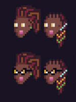
Head first, then the rest of her. I’m trialing two different hairstyles, with and without glasses.
She’s the brains of how BM can get in and out of digital worlds. It’s her project, she’s the one who sold Shigeru on the idea, got the funding, etc. She is bad ass.

Here is how she is in my head, thus far. Work in progress, thus far.

IMG_1038.gif
 

Diabolical

Senator
20,543
Subscriptor++
Holy smokes did I get stuck in on this!

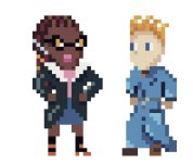
So, this was a royal pain in my butt. The goal was to have Dr. Ross wearing some sort of lab coat and not look insane. This was one of the biggest and most strenuous cases of obsessing over single pixel placement. It got… silly. Very silly. Factor in having to figure out how to make Dr. Ross look feminine was also a pain in the ass. How do you illustrate a bust, in pixels, via two pieces of clothing, in such a way that doesn’t look freaking comical? Oh man did that take awhile. I also tweaked her head, her hair, her glasses, her clothes, the size of her arms the placement of her left arm (the viewers right side). Man, it got nuts. NUTS I say.

The end result? I had her wearing a blue lab coat that was the shame general shade as Agent Black’s robe. Now, that could be a uniform thing, but I wanted to see if I could pull off a white lab coat.

The result? A gif with 2 second transitions to run through a variety of background colors, from transparent to flat black and white and a gray and a couple of other wilder colors.

1:1px, actual size.
2mBbOxx.gif


1:4px, about the size of most of full color Black Mage in the Black Mage Trap scene.
U22XH1O.gif


Getting that shading right to give her an actual bust line that made sense was a pain in the butt! But she looks much closer to a tall black woman with a bit of a bust, wearing a lab coat paired with black shirt and a pink skirt and a pair of shit kickers. Which is pretty much where I wanted her to be.

From the far left image to the next one in was about 4 days worth of trial and error. There’s probably a dozen different versions in there that I’m not showing. Ross 2, 3, 4 are all the same clothes, different head/hair/glasses options. Further editing was needed.

Ross 5, dark dark brown hair with pink and red streaks And the blue lab coat? That’s where I eventually ended up after working out the bust line and the rest of the shading, adjusted her head to be more reasonable and not ginormous, and really tweaked that far/left/back arm. That shoulder is turned away from the viewer slightly, and I wanted her to haver her arm go out a bit, then curl back in to her hip under her bust line. Working out how to do that in pixels took a bit, but I think I got it! My little desktop posable dude was used quite a bit for that!

Then I tried some color swaps to put the lab coat into a more ivory/related colors on the line in the palette. I kept her cuffs a very light blue to give it a small break in color at the wrists, but otherwise? I think I got it. She looks awesome! She makes Agent Black look kinda like ass.

Which is fine. She SHOULD make Agent Black look kinda like ass. She’s the head of this facility, the person who wrangled together the funding, got the partnership with Shigeru, and made all of this possible to… well, that is to come. :D

But getting from initial concept through all the way to the final product? Took over a week, usually 45 minutes to two hours a day of tweaking and testing and referencing. But there it is. She looks awesome. A.W.E.Some.

And now, I want to do something really different before hitting back to the is or back to the car (tunnel next! lighting experimentation! it’s going to be so much fun!).

But for right now, sleep.

edit: so many spelling mistakes! Yeah, I’m blaming that on being super tired. Apologies!
 
Last edited:

Diabolical

Senator
20,543
Subscriptor++
Here is, barring any future tweaks, the full Dr. Ross! Switch between dark mode and light mode to really see the contrast in colors for her hair, glasses, lab coat, boots, etc.

Q29sfFZ.png


And zoomed in 4x:
9w0ucvD.png


She has been a fully developed character in my head for over a year now. And seeing her rendered like this? I am so stoked with how she came out! It took the better part of a month to go from a blank screen and an idea to this, but I feel that it was worth it.

And yeah, she makes BM / Agent Black look … not so good. 😖 :p

Next? Something different!